Theming
The theming options for the page editor builder provide a seamless way to create a visually consistent and unique website design. The editor allows you to craft a custom color palette, enabling precise adjustments to backgrounds, text, buttons, and other design elements.
🎨 Customize Builder UI Themes
You can customize the Brizy Builder UI by overriding default color variables via the config.ui.colors object.
This allows you to fully theme the editor to match your branding or design system.
const config = {
  // ... other config keys
  ui: {
    theme: {
      colors: {
        "--ui-main-color": "#ffffff", // UI main color
        "--active-color": "#3dbfe8", // Highlight color
        "--icons-color": "#37352F", // Icons color
        "--toolbars-icons-separators": "#E6E6E5", // Toolbar icons separators

        "--sidebar-background": "#ffffff", // Sidebars left and right background
        "--sidebar-header": "#f2f2f2", // Sidebars left and right headers
        "--sidebar-separators": "#E6E6E5", // Sidebars separators
        "--borders": "#e0e0e0", // Borders for the elements in the left sidebar

        "--inputs-bg": "#f2f2f2", // All inputs background
        "--input-placeholder-text": "#545454", // Placeholder default text in inputs
        "--text-labels": "#3a3a3a", // Text labels

        "--column-lvl1-border": "#3dbfe8", // Border for the lvl 1 column in the editor (optional)
        "--column-lvl2-border": "#ed2164", // Border for the lvl 2 column in the editor (optional)
        "--row-and-default-elements-border": "#879294", // Border for the row and default elements in the editor (optional)
        "--draggable-block-padding-bg": "rgba(61,191,232,.15)", // Block top and bottom draggable padding in editor (optional)

        "--ui-shadows": "rgba(0,0,0, 0.2)", // UI shadows for toolbars and sidebars
      },
    },
  },
};
💡 These CSS variables follow the internal structure used by Brizy, so your customizations apply consistently across the UI.
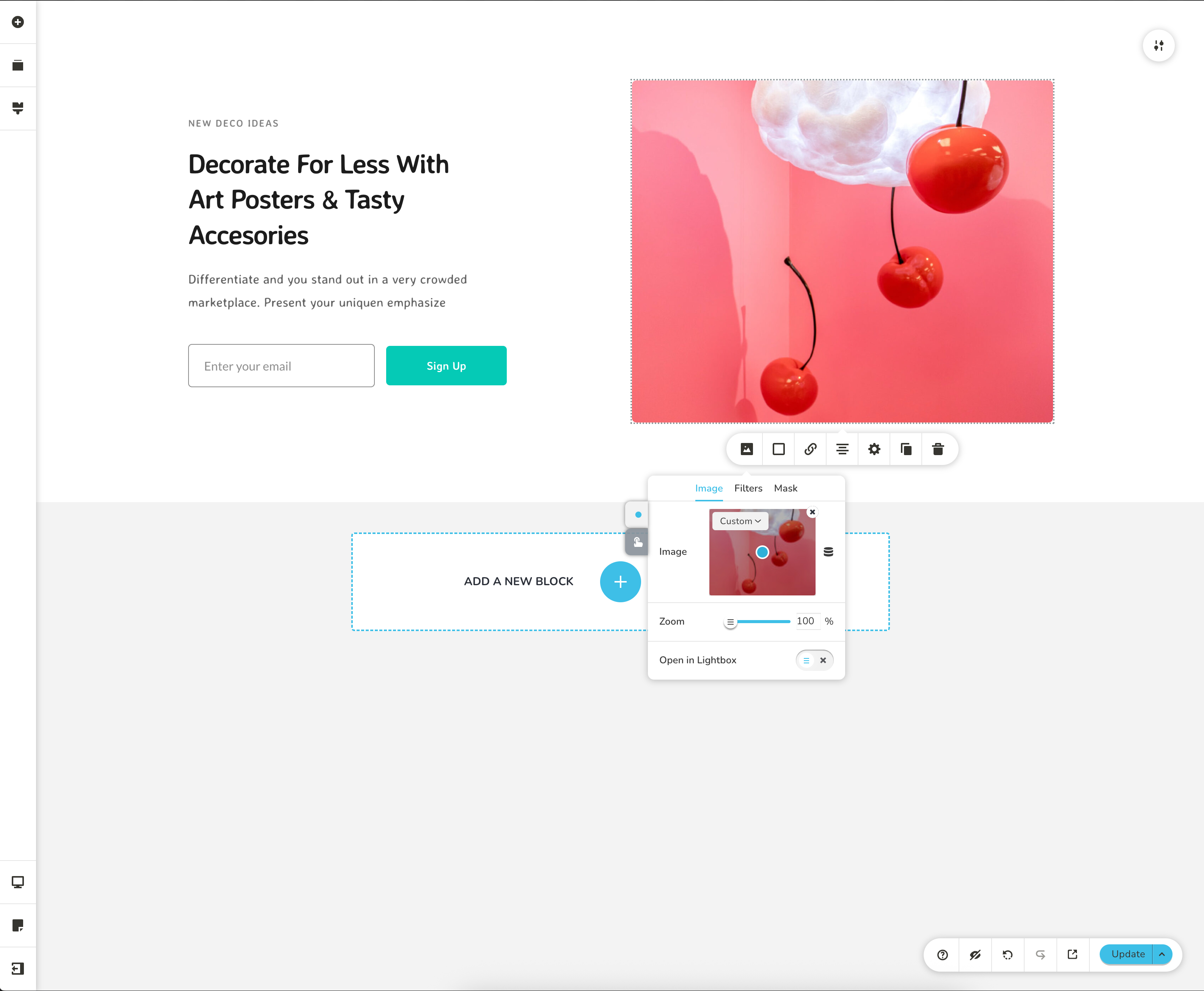
🖼️ Screenshots
Default UI
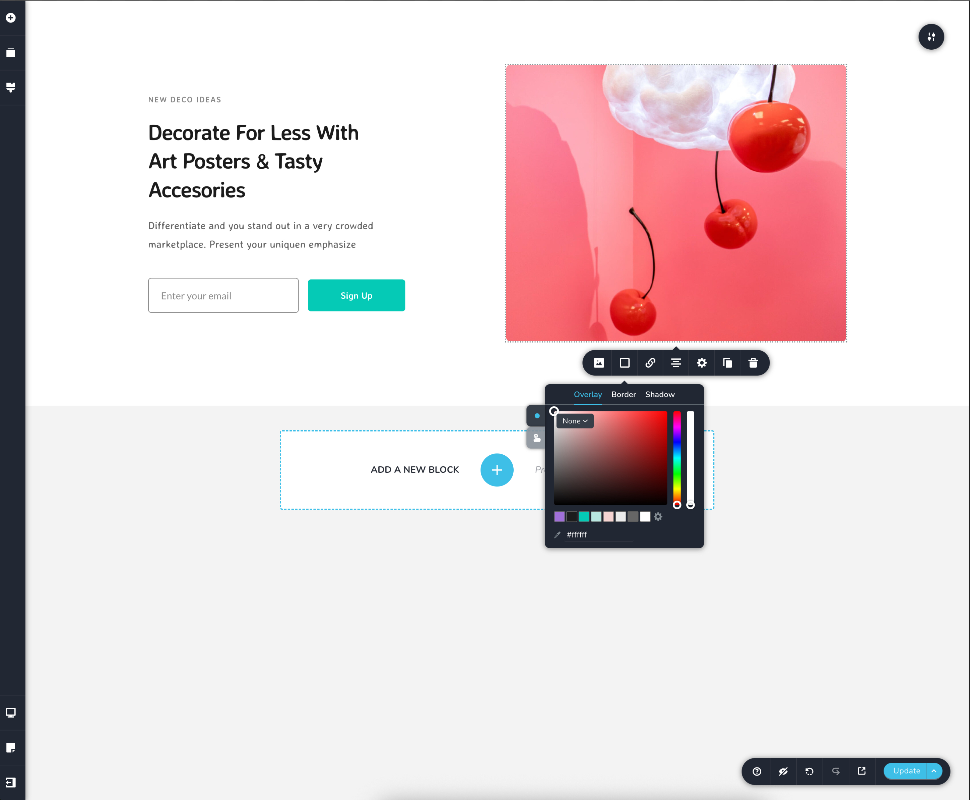
Customized Theme