Creating Your First Widget
Creating a directory for widget
The <YOUR_WIDGET> directory will contains all necessary files for your custom-built widget.
├── node_modules/
├── package.json
├── package-lock.json
├── prettier.config.js
├── tsconfig.json
├── README.md
├── .editorconfig
└── src/
    ├── Map/
    │    └── /* will contain all widget logic and style files */
    ├── Counter/
    │    └── /* will contain all widget logic and style files */
    ├── types/
    │    └── files.d.ts
    ├── <YOUR_WIDGET>/
    │    └── index.tsx
    └── config.json
    └── index.editor.ts
    └── index.view.ts
To start the build, run the following command in your terminal:
npm run build
For more information about the available scripts, check the
README.
Usage
After building the third-party library, you can send it to the editor configuration via HTTP URLs. Here's how you can do it:
- Host the built library files on a server accessible via HTTP.
- Obtain the HTTP URLs for the built JavaScript files (e.g.,
index.editor.js). - In the editor configuration, specify these URLs to load the library:
const config = {
  // Other keys of the config...

  extensions: [
    {
      host: "https://<the-build-host-of-library>",
      path: "",
    },
  ],
};
For more information about the config of the Editor, check the
README. Replace"http://<the-build-host-of-library>"with the actual HTTP URL of your built library file. By adding this URL to theextensionsarray in your editor configuration, the library will be loaded and available for use within the editor environment.
Thehostspecifies the server's URL, whilepathindicates the server directory containing the bundles.
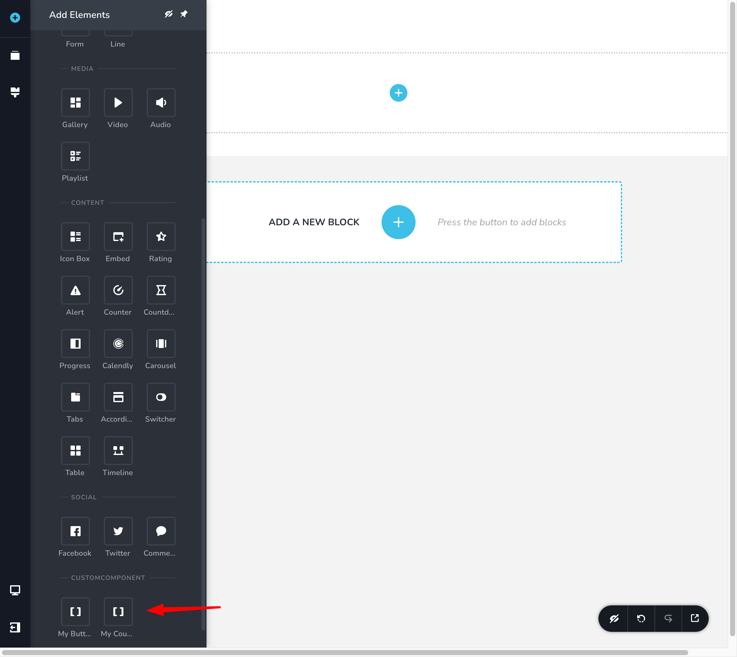
To view the new component, follow these steps:
- Go to the Left Sidebar of the editor.
- Look for the "Add Elements" section.
- Click on "Add Elements" to expand the section.
- You should see a list of available elements or components.
- Look for the newly added component within this list.
Basic Example of Button Component
Creating third-party widgets requires implementing two separate components: one for the editor view (used to manage editing behavior and interactions) and another for the preview view, which displays how the component will appear on the final, compiled page as seen by end users.
Create the widget inside <YOUR_WIDGET> folder.
export function Button() {
  return <div className="button">This button will be render in editor</div>;
}

export function ButtonView() {
  return <div className="button button-view">This button will be render in View</div>;
}