Group
Brizy's group control simplifies the interface by removing the divider line between controls, creating a more
streamlined
and cohesive layout.
For group control, the id property has no effect and is used only to separate groups by names
Example of controls wrapped in group control:
Example of the same controls without group control:
Parameters
| Name | Type | Default | Description |
|---|---|---|---|
id | string | - | The identifier of the key where the switch will save your data |
type | string | - | Type should be "group" to use this control |
label? | string | - | The label displayed on the left side of the control |
position? | number | - | The position of the control in toolbar |
className? | string | - | The custom CSS class name that will be set on the control. It can be used to modify the control styles. |
roles? | Array<Role> | - | Render the control only if the current user's role matches one of the roles in the provided array. type Role = "admin" | "viewer" | "editor" | "designer" | "manager" |
devices? | "all" | "desktop" | "responsive" | "all" | Define the devices where the control will be rendered. "all" renders the control on all devices. "desktop" renders the control only on desktop devices. "responsive" renders the control on both tablet and mobile devices. |
states? | Array<State> | ["normal"] | Allows for different styles based on the element's state State = "normal" | "hover" | "active" "normal" - the normal state of an element, "hover" - the state when the element is hovered over, "active" - the state when the element is active (e.g., current page in pagination) |
disabled? | boolean | false | Configure the condition under which the control is disabled or enabled. |
display? | "inline" | "block" | "inline" | Configure how the control and its label will be arranged. If display is "inline" then label and control will be in one row, if display is "block" then label will be in one row, and the next row down will be the control. |
options | Array<ControlItem> | - | An array of controls that will be grouped together. ControlItem : {id: number; type: string; disabled: boolean; position: number; devices: "all"` | `"desktop"` | `"responsive"} |
Basic example
In this example, we implemented the group control with two options wrapped in it.
const getToolbarItems = ({ getValue }) => {
  const closeButtonState = getValue("closeButtonState");

  return [
    {
      id: "groupCloseButton",
      type: "group",
      devices: "desktop",
      options: [
        {
          id: "closeButtonState",
          type: "switch",
          label: "Display Close Button"
        },
        {
          id: "delay",
          label: "Delay",
          type: "slider",
          disabled: closeButtonState === "off",
          config: {
            min: 0,
            max: 10,
            units: [{ title: "s", value: "s" }]
          }
        }
      ]
    }
  ]
}
Return value
This control does not return a value.
Usage
Label example
Adding a label on the left side of the control.
{
  id: "groupSettings",
  type: "group",
  label: "Settings",
  options: [
    {
      id: "width",
      type: "slider",
      label: "Width"
    },
    {
      id: "height",
      type: "slider",
      label: "Height"
    }
  ]
}
Class name example
Adding a CSS class to the control's DOM node.
{
  id: "borderRadiusTypeGroup",
  type: "group",
  className: "brz-radius-group",
  options: [
    {
      id: "borderRadiusType",
      label: "Corner",
      type: "radioGroup",
      choices: [
          { value: "square", icon: "nc-corners-square" },
          { value: "rounded", icon: "nc-corners-round" },
          { value: "custom", icon: "nc-more" }
      ]
    },
    {
      id: "borderRadius",
      type: "slider"
    }
  ]
}
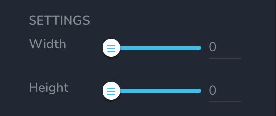
Display example
In this example, with display: "block", the label will be rendered on the first row and the control on the second.

{
  id: "groupSettings",
  type: "group",
  label: "SETTINGS",
  display: "block",
  options: [
    {
      id: "width",
      type: "slider",
      label: "Width"
    },
    {
      id: "height",
      type: "slider",
      label: "Height"
    }
  ]
}
Roles example
Show the control only to users with admin and designer privileges.
{
  id: "groupControl",
  type: "group",
  roles: ["admin", "designer"]
}
Devices examples
It will be rendered on all devices. This value can be skipped because it is set to "all" by default.
{
  id: "groupControl",
  type: "group",
  devices: "all"
}
Rendering will occur only on desktop.
{
  id: "groupControl",
  type: "group",
  devices: "desktop"
}
The display is limited to responsive modes, specifically tablet and mobile.
{
  id: "groupControl",
  type: "group",
  devices: "responsive"
}
States example
Allows the control to work in normal and hover states.
{
  id: "groupControl",
  type: "group",
  states: ["normal", "hover"]
}
Allows the control to work in normal, hover and active states.
{
  id: "groupControl",
  type: "group",
  states: ["normal", "hover", "active"]
}
Disabled examples
Control will be disabled. Normally, here should be your dynamic condition.
{
  id: "groupControl",
  type: "group",
  disabled: true
}
Control will be disabled when videoType variable will be "custom".
getValue is a getter function that allows us to retrieve the value of controls by their id.
"videoType" is the id of the "select" control below.
const getToolbarContols = ({ getValue }) => {
  const videoType = getValue("videoType");

  return [
    {
      id: "videoType",
      type: "select",
      choices: [
        { title: "Youtube", value: "youtube" },
        { title: "Custom", value: "custom" }
      ]
    },
    {
      id: "groupCloseButton",
      type: "group",
      devices: "desktop",
      disabled: videoType === "custom",
      options: [
        {
          id: "closeButtonState",
          type: "switch",
          label: "Display Close Button"
        },
        {
          id: "delay",
          label: "Delay",
          type: "slider",
          disabled: closeButtonState === "off",
          config: {
            min: 0,
            max: 10,
            units: [{ title: "s", value: "s" }]
          }
        }
      ]
    }
  ]
}