Filters
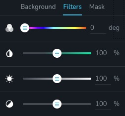
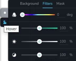
The control provides a user interface for adjusting CSS filter properties. It features four sliders, each responsible for modifying a specific filter property: hue, brightness, contrast, and saturation.
Example of control:

Example of control with state "hover":

Parameters
| Name | Type | Default | Description |
|---|---|---|---|
id | string | - | The identifier of the key where the control will save your data |
type | string | - | Type should be "filters" to use this control |
position? | number | - | The position of the control in toolbar |
roles? | Array<Role> | - | Render the control only if the current user's role matches one of the roles in the provided array. type Role = "admin" | "viewer" | "editor" | "designer" | "manager" |
devices? | "all" | "desktop" | "responsive" | "all" | Define the devices where the control will be rendered. "all" renders the control on all devices. "desktop" renders the control only on desktop devices. "responsive" renders the control on both tablet and mobile devices |
disabled? | boolean | false | Configure the condition under which the control is disabled or enabled. |
states? | Array<State> | ["normal"] | Allows for different styles based on the element's state State = "normal" | "hover" | "active" "normal" - the normal state of an element, "hover" - the state when the element is hovered over, "active" - the state when the element is active (e.g., current page in pagination) |
default? | Default | - | The default control value. Default: { brightness: number; hue: number; saturation: number; contrast: number; } brightness - adjusts the brightness of an image or element hue - controls the hue (color) applied to an image or element saturation - adjusts the color saturation applied contrast - controls the contrast between colors |
selector? | string | - | The CSS selector to which the styles will be applied |
style? | function | - | This function generates CSS output based on the value from the control. The parameter is an object containing a value key, which holds the current value of the control. The function returns an object with a CSS selector key and CSS property values.
|
Basic example
Standard definition with only the required keys. This control will be displayed on all devices.
{
  id: "filters",
  type: "filters"
}
Return value
Control returns an object with current values for each filter property.
{
  brightness: number;
  hue: number;
  saturation: number;
  contrast: number;
}
Example of value:
{
  brightness: 100,
  hue: 0,
  saturation: 100,
  contrast: 100
}
Usage
Roles example
Show the control only to users with admin and designer privileges.
{
  id: "filters",
  type: "filters",
  roles: ["admin", "designer"]
}
Devices examples
It will be rendered on all devices. This value can be skipped because it is set to "all" by default.
{
  id: "filters",
  type: "filters",
  devices: "all"
}
Rendering will occur only on desktop.
{
  id: "filters",
  type: "filters",
  devices: "desktop"
}
The display is limited to responsive modes, specifically tablet and mobile.
{
  id: "filters",
  type: "filters",
  devices: "responsive"
}
Disabled examples
Control will be disabled. Normally, here should be your dynamic condition.
{
  id: "filters",
  type: "filters",
  disabled: true
}
Control will be disabled when videoType variable will be "custom".
getValue is a getter function that allows us to retrieve the value of controls by their id.
"videoType" is the id of the "select" control below.
const getToolbarContols = ({ getValue }) => {
  const videoType = getValue("videoType");

  return [
    {
      id: "videoType",
      type: "select",
      choices: [
        { title: "Youtube", value: "youtube" },
        { title: "Custom", value: "custom" }
      ]
    },
    {
      id: "filters",
      type: "filters",
      disabled: videoType === "custom"
    }
  ]
}
States example
Use the control in the normal and hover states independently.
{
  id: "filters",
  type: "filters",
  states: ["normal", "hover"]
}
Allows the control to work in normal, hover and active states.
{
  id: "filters",
  type: "filters",
  states: ["normal", "hover", "active"]
}
Default value examples
The default control value will be applied for brightness, hue, saturation, and contrast.
{
  id: "filters",
  type: "filters",
  default: {
    brightness: 100,
    hue: 100,
    saturation: 100,
    contrast: 100
  }
}
Setting a default value for the hue property only. Other properties will be 0.
{
  id: "filters",
  type: "filters",
   default: {
    hue: 100
  }
}
CSS examples
Configure the CSS filter properties of the .brz-image element using the selector.
{
  id: "filters",
  type: "filters",
  selector: ".brz-image"
}
This code dynamically adjusts the filter properties of elements with the class .brz-image based on the values of hue, saturation, brightness, and contrast.
{
  id: "filters",
  type: "filters",
  style: ({ value }) => {
    const { hue, saturation, brightness, contrast } = value;

    return {
      ".brz-image": {
        filter: `brightness(${brightness}%) hue-rotate(${hue}deg) saturate(${saturation}%) contrast(${contrast}%);`
      }
    };
  }
}
Usage in HTML example
In the example below, we demonstrate how to implement the filters control and apply its values to an image element's CSS properties.
import { Brizy } from "@brizy/core";
import React, { JSX } from "react";

interface Props {
  brightness: number;
  hue: number
  saturation: number;
  contrast: number;
}

const Image = (props: Props): JSX.Element => {
  const { brightness, hue, saturation, contrast } = props;

  const filterStyle = {
    filter: `brightness(${brightness}%) hue-rotate(${hue}deg) saturate(${saturation}%) contrast(${contrast}%);`
  };

  return (
    <div className="brz-image" style={filterStyle}>
      <img src="image-source.jpg"/>
    </div>
  );
};

Brizy.registerComponent({
  id: "ThirdParty.Image",
  component: { editor: Image, view: Image },
  title: "My Image",
  category: "essentials",
  options: (props) => {
    return [
      {
        selector: ".brz-image",
        toolbar: [
          {
            id: "settingsTabs",
            type: "tabs",
            tabs: [
              {
                id: "filters",
                label: "Filters",
                options: [
                  {
                    id: "filters",
                    type: "filters"
                  }
                ]
              }
            ]
          }
        ]
      }
    ];
  },
});