Animation
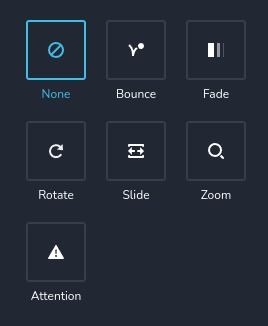
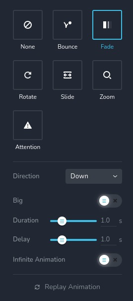
The animation control provides access to 13 pre-built animations that can be applied to elements in both their normal state and on hover. It allows customization of parameters such as duration, delay, direction, and more.
Example of the control:

Example of the control with "fade" animation selected:

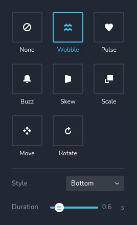
Example of the control with animations usually used on "hover":

Parameters
| Name | Type | Default | Description |
|---|---|---|---|
id | string | - | The identifier of the key where the animation will save your data |
type | string | - | Type should be "animation" to use this control |
label? | string | - | The label displayed on the top side of the control |
className? | string | - | The custom CSS class name that will be set on the control. It can be used to modify the control styles |
icon? | string | - | Icon name that will be rendered on left side of the control's label. View all icons |
position? | number | - | The position of the control in toolbar |
roles? | Array<Role> | - | Render the control only if the current user's role matches one of the roles in the provided array. type Role = "admin" | "viewer" | "editor" | "designer" | "manager" |
devices? | "all" | "desktop" | "responsive" | "all" | Define the devices where the control will be rendered. "all" renders the control on all devices. "desktop" renders the control only on desktop devices. "responsive" renders the control on both tablet and mobile devices |
disabled? | boolean | false | Configure the condition under which the control is disabled or enabled |
helper?.content | string | - | If provided, displays an icon next to the label. When hovering over this icon, a tooltip with additional information appears |
helper?.position? | "top-start" | "top" | "top-end" | "right-start" | "right" | "right-end" | "bottom-end" | "bottom" | "bottom-start" | "left-end" | "left" | "left-start" | "top" | Specifies the position of the tooltip relative to the helper icon |
config?.type | Array<EffectType> | ["none", "bounce", "fade", "rotate", "slide", "zoom", "attention"] | Specifies the list of animation types that will be available for use EffectType = "none" | "bounce" | "fade" | "rotate" | "slide" | "zoom" | "attention" | "pulse" | "wobble" | "buzz" | "scale" | "skew" | "move" |
config?.replay | boolean | true | Enables the ability to replay the animation by clicking a special button. If false the button will not render |
config?.infiniteAnimation | boolean | true | Allows the animation to loop indefinitely. This can be toggled using a special switch toggler. If false the switch will not render |
config?.delay | boolean | true | Enables the ability to change the delay of the animation using a special slider. If false the slider will not render |
default? | Default | - | The default control value. Default: { name: AnimationName; duration: number; delay: number; infiniteAnimation: boolean; } name - the name of the animation, duration - the duration of the animation in milliseconds delay - the delay before the animation starts, in milliseconds, infiniteAnimation - indicates whether the animation should loop indefinitely, AnimationName is a distinct string that identifies the animation. You can also define the animation with a particular direction or style. Here is a list of all animation names: None "none" - no animation Entrance animations 1. Bounce "bounce" - with direction None "bounceIn" - with direction In "bounceInDown" - with direction Down "bounceInRight" - with direction Right "bounceInUp" - with direction Up "bounceInLeft" - with direction Left 2. Fade "fadeIn" - with direction None "fadeInDown" - with direction Down and Big set to false "fadeInDownBig" - with direction Down and Big set to true "fadeInRight" - with direction Right and Big set to false "fadeInRightBig" - with direction Right and Big set to true "fadeInUp" - with direction Up and Big set to false "fadeInUpBig" - with direction Up and Big set to true "fadeInLeft" - with direction Left and Big set to false "fadeInLeftBig" - with direction Left and Big set to true 3. Rotate "rotateIn" - with direction None "rotateInDownLeft" - with direction Down Left "rotateInDownRight" - with direction Down Right "rotateInUpLeft" - with direction Up Left "rotateInUpRight" - with direction Up Right 4. Slide "slideInDown" - with direction Down "slideInRight" - with direction Right "slideInUp" - with direction Up "slideInLeft" - with direction Left 5. Zoom "zoomIn" - with direction None "zoomInDown" - with direction Down "zoomInRight" - with direction Right "zoomInUp" - with direction Up "zoomInLeft" - with direction Left 6. Attention "flash" - with style Flash "jackInTheBox" - with style JackInTheBox "jello" - with style Jello "lightSpeedIn" - with style Light Speed In "pulse" - with style Pulse "rollIn" - with style Roll In "rubberBand" - with style Rubber Band "tada" - with style Tada "shake" - with style Shake "swing" - with style Swing "wobble" - with style Wobble Hover animations 1. Wobble "brz-wobble-horizontal" - with style Horizontal "brz-wobble-vertical" - with style Vertical "brz-wobble-to-bottom-right" - with style Bottom Right "brz-wobble-to-top-right" - with style Top Right "brz-wobble-top" - with style Top "brz-wobble-bottom" - with style Bottom "brz-wobble-skew" - with style Skew 2. Pulse "brz-pulse" - with style Pulse "brz-pulse-grow" - with style Pulse Grow "brz-pulse-shrink" - with style Pulse Shrink 3. Buzz "brz-buzz" - with style Buzz "brz-buzz-out" - with style Buzz Out 4. Skew "brz-skew" - with style Skew "brz-skew-forward" - with style Skew Forward "brz-skew-backward" - with style Skew Backward 5. Scale "brz-pop" - with style Pop "brz-push" - with style Push "brz-bounce-in" - with style Bounce In "brz-bounce-out" - with style Bounce Out "brz-grow" - with style Grow "brz-shrink" - with style Shrink 6. Move "brz-float" - with direction Up "brz-sink" - with direction Down "brz-backward" - with direction Left "brz-forward" - with direction Right "brz-hang" - with direction Hang "brz-bob" - with direction Bob 7. Rotate "brz-rotate" - with style Rotate "brz-grow-rotate" - with style Grow Rotate |
style? | function | - | This function generates CSS output based on the value from the control. The parameter is an object containing a value key, which holds the current value of the control. The function returns an object with a CSS selector key and CSS property values.
|
Basic example
Standard definition with only the required keys. This control will be displayed on all devices.
{
  id: "animation",
  type: "animation"
}
Return value
Returns an object with the following values:
{
  name: AnimationName;
  duration: number;
  delay: number;
  infiniteAnimation: false;
}
name - the same animations described in Parameters - default;
duration - the duration of the animation in milliseconds;
delay - the delay before the animation starts, in milliseconds;
infiniteAnimation - indicates whether the animation should loop indefinitely;
Example of the value:
{
  delay: 0,
  duration: 600,
  infiniteAnimation: true,
  name: "fadeInDownBig"
}
Usage
Label example
Adds a label to the top of the list of animations.
{
  id: "animation",
  label: "Animations",
  type: "animation"
}
Class name example
Adding a CSS class to the control's DOM node.
{
  id: "animation",
  type: "animation"
  className: "myAnimation"
}
Icon example
Adding a "settings" icon to the left of the control's label.
{
  id: "animation",
  type: "animation"
  icon: "nc-cog"
}
Roles example
Show the control only to users with admin and designer privileges.
{
  id: "animation",
  type: "animation",
  roles: ["admin", "designer"]
}
Devices examples
It will be rendered on all devices. This value can be skipped because it is set to "all" by default.
{
  id: "animation",
  type: "animation",
  devices: "all"
}
Rendering will occur only on desktop.
{
  id: "animation",
  type: "animation",
  devices: "desktop"
}
The display is limited to responsive modes, specifically tablet and mobile.
{
  id: "animation",
  type: "animation",
  devices: "responsive"
}
Disabled example
Control will be disabled. Normally, here should be your dynamic condition.
{
  id: "animation",
  type: "animation",
  disabled: true
}
Control will be disabled when videoType variable will be "custom".
getValue is a getter function that allows us to retrieve the value of controls by their id.
"videoType" is the id of the "select" control below.
const getToolbarContols = ({ getValue }) => {
  const videoType = getValue("videoType");

  return [
    {
      id: "videoType",
      type: "select",
      choices: [
        { title: "Youtube", value: "youtube" },
        { title: "Custom", value: "custom" }
      ]
    },
    {
      id: "animation",
      type: "animation",
      disabled: videoType === "custom"
    }
  ]
}
Helper example
The helper object contains a content property with the value "help text", which will be displayed as additional guidance or information for the user.
{
  id: "animation",
  type: "animation",
  helper: {
    content: "help text"
  }
}
When the helper object contains a position property with the value "top-start", it indicates that the helper text will be displayed in the top left corner of the icon.
{
  id: "animation",
  type: "animation",
  helper: {
    content: "help text",
    position: "top-start"
  }
}
Config types example
Specifies the list of animation types that will be available for use.
{
  id: "animation",
  type: "animation",
  config: {
    types: ["wobble", "buzz", "scale"]
  }
}
Config replay example
Enables the ability to replay the animation by clicking a special button. In this case the button will not render.
{
  id: "animation",
  type: "animation",
  config: {
    replay: false
  }
}
Config infiniteAnimation example
Allows the animation to loop indefinitely. This can be toggled using a special switch toggler. In this case the switch will not render.
{
  id: "animation",
  type: "animation",
  config: {
    infiniteAnimation: false
  }
}
Config delay example
Enables the ability to change the delay of the animation using a special slider. In this case the slider will not render and animation will not have a delay.
{
  id: "animation",
  type: "animation",
  config: {
    delay: false
  }
}
Default value example
In the default object you can set the default values for any animation properties. In this case, the element will
by default move slightly up on hover.
{
  id: "animation",
  type: "animation",
  default: {
    delay: 0,
    duration: 1000,
    infiniteAnimation: true,
    name: "brz-float"
  }
}
CSS example
This is an abstract example, and usually, you will not manually control any animation. In this case the map
background color will be red if the animation type is "pulse", otherwise it will be black.
{
  id: "animation",
  type: "animation",
  style: ({ value }) => {
    return {
      "{{WRAPPER}} .brz-ui-ed-iframe": {
        "background-color": value.type === "pulse" ? "red" : "black"
      }
    }
  }
}
Usage in HTML example
To retrieve the control's return value, access the necessary values from the component's props using the following rule:
concatenate the id of the animation control with the value you wish to extract. The example below demonstrates
how to extract all the values from entrance and hover animations.
import { Brizy } from "@brizy/core";

interface Props {
  animationName: string;
  animationDelay: number;
  animationInfiniteAnimation: boolean;
  animationDuration: number;
  hoverName: string;
  hoverDelay: number;
  hoverInfiniteAnimation: boolean;
  hoverDuration: number;
}

const Component = (props: Props) => {
  const {
    animationName,
    animationDelay,
    animationInfiniteAnimation,
    animationDuration,
    hoverName,
    hoverDelay,
    hoverInfiniteAnimation,
    hoverDuration
  } = props;

  return <div className="component">
    <p style={{ color: animationName === "bounce" ? "black" : "red", transition: `color ${animationDuration / 1000}s` }}>Text</p>
    <p style={{ color: hoverAnimation === "brz-buzz" ? "blue" : "yellow", transition: `color ${hoverDuration / 1000}s` }}>Text</p>
  </div>;
}

Brizy.registerComponent({
  id: "ThirdParty.Component",
  component: { editor: Component, view: Component },
  title: "Component",
  category: "custom",
  options: (props) => {
    return [
      {
        selector: ".component",
        sidebar: [
          {
            id: "sidebarTabs",
            type: "sidebarTabs",
            tabs: [
              {
                id: "effects",
                title: "Effects",
                label: "Effects",
                options: [
                  {
                    id: "tabs",
                    type: "tabs",
                    config: {
                      align: "start"
                    },
                    tabs: [
                      {
                        id: "entrance",
                        label: "Entrance",
                        options: [
                          {
                            id: "animation",
                            type: "animation"
                          }
                        ]
                      },
                      {
                        id: "tabHover",
                        label: "Hover",
                        options: [
                          {
                            id: "hover",
                            type: "animation",
                            config: {
                              types: ["wobble", "pulse", "buzz", "skew", "scale", "move", "rotate2"],
                              replay: false,
                              infiniteAnimation: true,
                              delay: false
                            },
                            default: {
                              name: "none",
                              duration: 0,
                              delay: 0,
                              infiniteAnimation: false
                            }
                          }
                        ]
                      }
                    ]
                  }
                ]
              }
            ]
          }
        ]
      }
    ]
  }
})