Color Picker
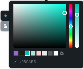
Brizy's colorPicker control offers a user-friendly color picker field with an integrated opacity slider, hue slider, and predefined palette colors.
Example of the colorPicker:

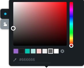
Example of the colorPicker with disabled opacity:

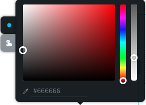
Example of the colorPicker with disabled color palette:

Parameters
| Name | Type | Default | Description |
|---|---|---|---|
id | string | - | The identifier of the key where the colorPicker will save your data |
type | string | - | Type should be "colorPicker" to use this control |
className? | string | - | The custom CSS class name that will be set on the control. It can be used to modify the control styles. |
position? | number | - | The position of the control in toolbar |
roles? | Array<Role> | - | Render the control only if the current user's role matches one of the roles in the provided array. type Role = "admin" | "viewer" | "editor" | "designer" | "manager" |
devices? | "all" | "desktop" | "responsive" | "all" | Define the devices where the control will be rendered. "all" renders the control on all devices. "desktop" renders the control only on desktop devices. "responsive" renders the control on both tablet and mobile devices. |
disabled? | boolean | false | Configure the condition under which the control is disabled or enabled. |
states? | Array<State> | ["normal"] | Allows the control to work in different states. State = "normal" | "hover" | "active" "normal" - the normal state of an element, "hover" - the state when the element is hovered over, "active" - the state when the element is active (e.g., current page in pagination) |
config?.opacity | boolean | true | Controls whether the opacity of the color can be changed. If set to false, the opacity slider will not be rendered. |
config?.isPaletteHidden | boolean | false | Controls whether the palette of the color can be changed. If set to true, the color palette will not be rendered. |
default? | Default | - | The default control value. Default: { hex: string; palette: string; opacity: number; } hex - the control's custom hex value palette - the control's custom palette value opacity - the control's custom opacity value |
style? | function | - | This function generates CSS output based on the value from the control. The parameter is an object containing a value key, which holds the current value of the control. Additionally, when a palette color is selected, the value will also include paletteVar – the CSS variable for the selected palette color (e.g. --brz-global-color7), or null if no palette is set. The value of the CSS variable is an rgb triplet in the format r,g,b. The function returns an object with a CSS selector key and CSS property values.
|
Basic example
Standard definition with only the required keys. This control will be visible on all devices.
{
  id: "color",
  type: "colorPicker"
}
Return value
Returns an object with the following values:
{
  hex: string;
  opacity: number;
  palette: string | undefined;
}
hex - defines the color of the shadow in hexadecimal format;
opacity - indicates the opacity of the shadow;
palette - predefined palette from global styles;
Example of value:
{
  hex: "#ffffff",
  opacity: 1,
  palette: "color5"
}
Usage
Class name example
Adding a CSS class to the control's DOM node.
{
  id: "color",
  type: "colorPicker",
  className: "myClass"
}
Roles example
Show the control only to users with admin and designer privileges.
{
  id: "color",
  type: "colorPicker",
  roles: ["admin", "designer"]
}
Devices examples
It will be rendered on all devices. This value can be omitted since it defaults to "all".
{
  id: "color",
  type: "colorPicker",
  devices: "all"
}
Rendering will occur only on desktop.
{
  id: "color",
  type: "colorPicker",
  devices: "desktop"
}
The display is limited to responsive modes, specifically tablet and mobile.
{
  id: "color",
  type: "colorPicker",
  devices: "responsive"
}
Disabled examples
Control will be disabled. Normally, here should be your dynamic condition.
{
  id: "color",
  type: "colorPicker",
  disabled: true
}
Control will be disabled when videoType variable will be "custom".
getValue is a getter function that allows us to retrieve the value of controls by their id.
"videoType" is the id of the "select" control below.
const getToolbarContols = ({ getValue }) => {
  const videoType = getValue("videoType");

  return [
    {
      id: "videoType",
      type: "select",
      choices: [
        { title: "Youtube", value: "youtube" },
        { title: "Custom", value: "custom" }
      ]
    },
    {
      id: "color",
      type: "colorPicker",
      disabled: videoType === "custom"
    }
  ];
};
States example
Allows the control to work in normal and hover states.
{
  id: "color",
  type: "colorPicker",
  states: ["normal", "hover"]
}
Allows the control to work in normal, hover and active states.
{
  id: "color",
  type: "colorPicker",
  states: ["normal", "hover", "active"]
}
Config opacity example
Turns off the opacity slider
{
  id: "color",
  type: "colorPicker",
  config: {
    opacity: false
  }
}
Config isPaletteHidden example
Turns off the color palette
{
  id: "color",
  type: "colorPicker",
  config: {
    isPaletteHidden: true
  }
}
Default value examples
In this example, the colorPicker control that has the value "#d02213" by default.
{
  id: "color",
  type: "colorPicker",
  default: {
    hex: "#d02213",
    opacity: 1,
    palette: ""
  }
}
CSS examples
Change the color of the .brz-text element with CSS using custom values from a colorPicker control.
{
  id: "color",
  type: "colorPicker",
  style: ({ value }) => {
    return {
      "{{WRAPPER}} .brz-text": {
        color: value.value.hex
      },
      "{{WRAPPER}}":{
        opacity: value.value.opacity
      }
    }
  }
}
Additional example using the palette CSS variable (variable value is r,g,b):
{
  id: "color",
  type: "colorPicker",
  style: ({ value }) => {
    return {
      "{{WRAPPER}} .brz-text": {
        // rgba(var(--brz-global-colorN), opacity)
        color: value.value.paletteVar
          ? `rgba(var(${value.value.paletteVar}), ${value.value.opacity})`
          : value.value.hex
      }
    }
  }
}
Palette CSS variables available
When a palette swatch is chosen, the style function receives value.paletteVar as one of:
--brz-global-color1--brz-global-color2--brz-global-color3--brz-global-color4--brz-global-color5--brz-global-color6--brz-global-color7--brz-global-color8
If no palette is selected, value.paletteVar is null.
Usage in HTML example
In the example below, we use the colorPicker output value to determine the icon color in the button element.
import { Brizy } from "@brizy/core";
import React, { JSX } from "react";
import { Icon } from "./Icon";

interface Props {
  colorHex: string;
  colorOpacity: number;
}

const Button = (props: Props): JSX.Element => {
  const { colorHex, colorOpacity } = props;

  return (
    <div className="brz-button">
      <Icon size={16} color={colorHex} opacity={colorOpacity} />
    </div>
  );
};

Brizy.registerComponent({
  id: "ThirdParty.Button",
  component: { editor: Button, view: Button },
  title: "My Button",
  category: "custom",
  options: (props) => {
    return [
      {
        selector: ".brz-button",
        toolbar: [
          {
            id: "toolbarCurrentElement",
            type: "popover",
            config: {
              icon: "nc-button",
              title: "Button"
            },
            devices: "desktop",
            options: [
              {
                id: "color",
                type: "colorPicker",
                devices: "desktop"
              },
            ]
          }
        ]
      }
    ]
  }
});
Usage in sidebar example
The colorPicker can also be integrated into the sidebar. For improved user experience, it should remain minimized by default and only be rendered as a tooltip on click when invoked within a popover.
{
  id: "colors",
  type: "popover",
  label: "Color",
  config: {
    title: "Color",
    icon: {
      style: {
        backgroundColor: "red"
      }
    }
  },
  options: [{ id: "colorButton", type: "colorPicker" }]
}