Advanced Settings
The advancedSettings component is a clickable button that opens the right sidebar, giving users access to additional options.
Example of advancedSettings control:
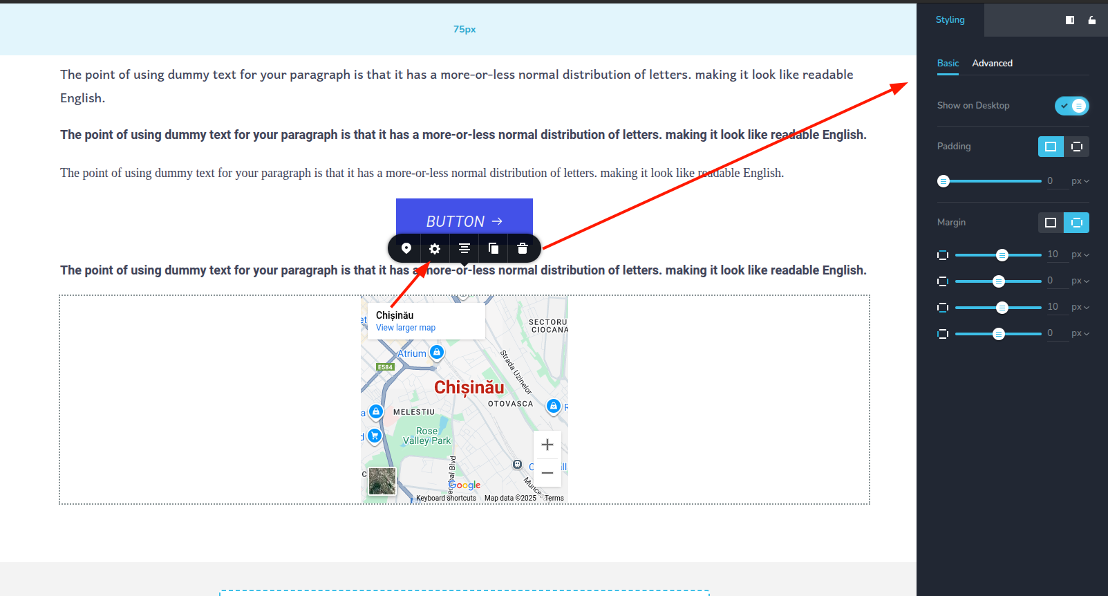
Parameters
| Name | Type | Default | Description |
|---|---|---|---|
id | string | - | The identifier of the key where the advancedSettings will save your data |
type | string | - | Type should be "advancedSettings" to use this control |
devices? | "all" | "desktop" | "responsive" | "all" | Define the devices where the control will be rendered. "all" renders the control on all devices. "desktop" renders the control only on desktop devices. "responsive" renders the control on both tablet and mobile devices |
disabled? | boolean | false | Configure the condition under which the control is disabled or enabled |
icon? | string | "nc-cog" | The icon name of the button |
className? | string | - | The custom CSS class name that will be set on the control. It can be used to modify the control styles. |
Basic example
Standard definition with only the required keys. This control will be displayed on all devices.
{
  id: "button",
  type: "advancedSettings"
}
Return value
The advancedSettings control does not return anything.
Usage
Devices examples
It will be rendered on all devices. This value can be skipped because it is set to "all" by default.
{
  id: "button",
  type: "advancedSettings",
  devices: "all"
}
Rendering will occur only on desktop.
{
  id: "button",
  type: "advancedSettings",
  devices: "desktop"
}
The display is limited to responsive modes, specifically tablet and mobile.
{
  id: "button",
  type: "advancedSettings",
  devices: "responsive"
}
Disabled examples
Control will be disabled. Normally, here should be your dynamic condition.
{
  id: "button",
  type: "advancedSettings",
  disabled: true
}
With icon example
Specifies the icon to be displayed with the control.
{
  id: "button",
  type: "advancedSettings",
  icon: "nc-flash"
}