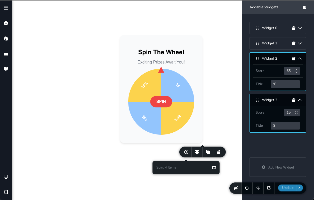
Spin Element
Below is an example showing how the spinner component (in a simplified form) was built as a third-party component in our editor, using the addable option. This demonstrates how a dynamic list of items can be defined through the configuration.
Define Component structure
Below, we define the structure of the component. For more details, you can visit the following link.
Editor Component
// import ...

export const Editor = (props: Props): ReactElement => {
    const [spinning, setSpinning] = useState(false);
    const [rotation, setRotation] = useState(0);
    const [selectedIndex, setSelectedIndex] = useState<number>();

    const items = getItems(props);

    const spinWheel = () => {
        setSpinning(true);
        const randomIndex = Math.floor(Math.random() * items.length);
        const extraSpins = 5 * 360; // Ensure at least 5 full rotations
        const finalAngle = (360 / items.length) * randomIndex;
        const newRotation = rotation + extraSpins + finalAngle;

        setRotation(newRotation);
        setTimeout(() => {
            setSpinning(false);
            setSelectedIndex(randomIndex);
        }, 3000);
    };
    const style = useMemo(
        () => ({
            transform: `rotate(${rotation}deg)`,
            transition: spinning ? "transform 3s ease-out" : "none",
        }),
        [rotation, spinning],
    );

    return (
        <Wrapper>
            <h2 className="spin-wheel-title">Spin The Wheel</h2>
            <p className="spin-wheel-subtitle">Exciting Prizes Await You!</p>

            <Items items={items} spinning={spinning} style={style} onSpinStart={spinWheel} />

            {selectedIndex !== undefined && !spinning && <Won data={items[selectedIndex ?? 0]} />}
        </Wrapper>
    );
};
View Component
export const View = (props: Props): ReactElement => {
    const items = getItems(props);

    return (
        <Wrapper>
            <h2 className="spin-wheel-title">Spin The Wheel</h2>
            <p className="spin-wheel-subtitle">Exciting Prizes Await You!</p>
            <Items items={items} />
            <Won />
        </Wrapper>
    );
};
Define a toolbar
export const getToolbar: GetToolbar = ({ t }) => {
  return [
    {
      selector: ".spin-wheel-container",
      toolbar: [
        {
          id: "toolbarCurrentElement",
          type: "popover",
          config: {
            icon: "nc-counter-outline",
            title: "Spin",
          },
          // Only for desktop devices
          devices: "desktop",
          position: 90,
          options: [
            {
              id: "spinItems",
              type: "addable",
              config: {
                title: "Spin",
                showCount: true,
              },
              shape: [
                {
                  id: "score",
                  label: t("Score"),
                  type: "number",
                },
                {
                  id: "title",
                  label: t("Title"),
                  type: "inputText",
                },
              ],
            },
          ],
        },
      ],
    },
  ];
};
Register Component in Editor
Brizy.registerComponent({
    id: "Brizy.ThirdParty.Spin",
    component: {
        editor: Editor,
        view: View,
    },
    title: "Spin",
    icon: "nc-counter-outline",
    category: "custom",
    options: getToolbar,
});